Designed for One Hand at 3 A.M.: Why Newborn Apps Need Better UX

Designed for One Hand at 3 A.M.
Steven Hoober's observational work on how people actually hold their phones found that roughly half use one hand and about three-quarters of all touches come from the thumb. The data is a decade old now, and it was collected in airports and on sidewalks, not in a dim nursery with a swaddled baby on one shoulder. The 3 a.m. version of that user is more extreme in every direction: one hand is already full, the thumb is the only input device, and the brain behind the thumb is running on a fraction of its usual sleep.
That is the real user of a newborn-care app. Most of them aren't designed for that user. They're designed for the version of you who downloaded the app in the hospital, well-lit and sitting up, with both hands free. What the daylight design misses about the 3 a.m. user is where most of these apps slip.
The Problem Shows Up at 3 A.M., Not in the Demo
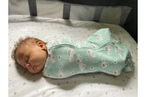
A newborn-care app looks fine on a product page. The feed timer is big, the diaper log is a tap, the sleep chart renders clean. Nobody logs a feed on a product page, though. They log it with a baby latched on, a muslin blanket slipping off one shoulder, and a phone wedged against a nursing pillow so the screen points slightly away from their face.
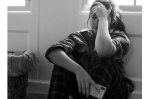
The context around that single tap is what breaks most apps. In the first month of life, nearly all infants wake during the night, and even at nine months only about a third sleep through without waking. A paper on sleep-deprived new mothers found that the brain networks that handle attention and decision-making are the ones that take the hit, which happen to be the exact systems the app is leaning on. Teams that take custom builds seriously, including shops like DEV.co, tend to start from that reality rather than from the hospital-bed version of the user.
A product that feels friendly in daylight can feel hostile at 3 a.m. The buttons didn't change. The user did.
Why "Add More Features" Keeps Making It Worse
The intuitive fix is to make the app smarter. Add growth curves, feeding analytics, a milestone tracker, a community tab, a sleep coach. Each one looks helpful on its own. Together, they push the one thing the parent came to do, which is log that this feed happened on this side right now, deeper into the interface.
There are three ways this backfires, and they stack.
- More tabs, smaller targets. Every new feature wants a home on the primary nav. The log-a-feed button shrinks, moves, or hides behind a plus icon. A thumb that could hit it half-asleep last week now misses.
- More decisions per tap. A "quick log" screen that asks for left vs. right, bottle vs. breast, ounces, and a note is four decisions. At 3 a.m., four decisions is three too many.
- More onboarding, less memory. A feature-rich app has to re-teach itself every few screens. The exhausted user doesn't learn; they tap something, get an unexpected modal, and give up.
The product team watches engagement climb on the new feature in testing and ships it. The parent, three weeks postpartum, switches to a notes app and a kitchen timer.
Design the One-Handed Path First
The approach that holds up is to design the exhausted path first and the daylight path second. That inverts how most teams work, and it changes concrete decisions. Start with the single most-repeated interaction and defend it the whole way through the build. Everything else bends around it.
- Oversize the primary target. Platform minimums (44pt on iOS, 48dp on Android) are a floor, not a goal. A practical cheatsheet on tap-target sizing argues that targets near the bottom of a phone should run closer to 46 pixels to cut mis-taps. For a log-a-feed button used at 3 a.m., go bigger than that.
- Put it where the thumb lives. On a modern phone held one-handed, the comfortable arc for the thumb is the bottom third of the screen, slightly off-center toward the holding hand. That is where the most-tapped button belongs.
- Make the first tap commit something. The log button should record a feed the instant it is tapped, with sensible defaults, and let the parent edit later. A screen that asks four questions before saving anything loses the data the moment the baby unlatches.
- Design for the dark. A true dark theme, no white flashes between screens, no modal that steals focus. The phone is a flashlight pointed at a sleeping baby's face. Treat it that way.
- Respect the thumb that isn't there. Any flow that needs two hands (pinch, long-press-and-drag, double-tap-then-swipe) is a flow that won't be used. If the feature requires it, build a one-handed fallback.
None of this is anti-feature. Growth curves and sleep analytics still ship. They live one layer down, where the daylight user finds them and the 3 a.m. user never has to.